Challenge
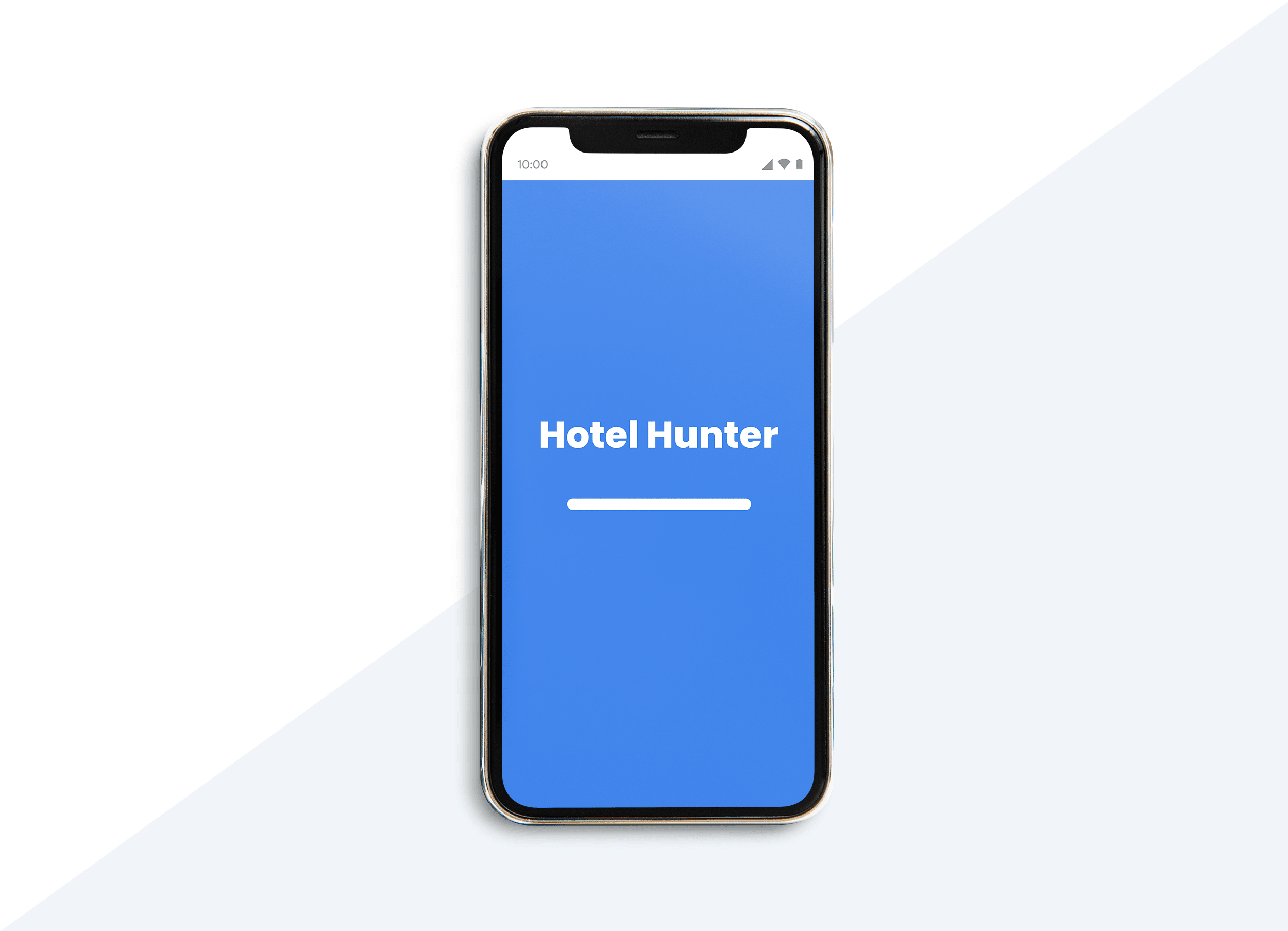
This project is a piece of student work that I completed while studying UX. It covers the end-to-end design process for a hotel booking app. You can jump to the prototype here
My client is a new hotel chain. They’re looking to create an online booking experience that is simple, accessible and based on a deep understanding of their target users. This was a solo student project and all the work is my own.
My task was to design a new mobile app, focusing specifically on the booking process: how users search for and book hotel rooms online.
Strategy
Research
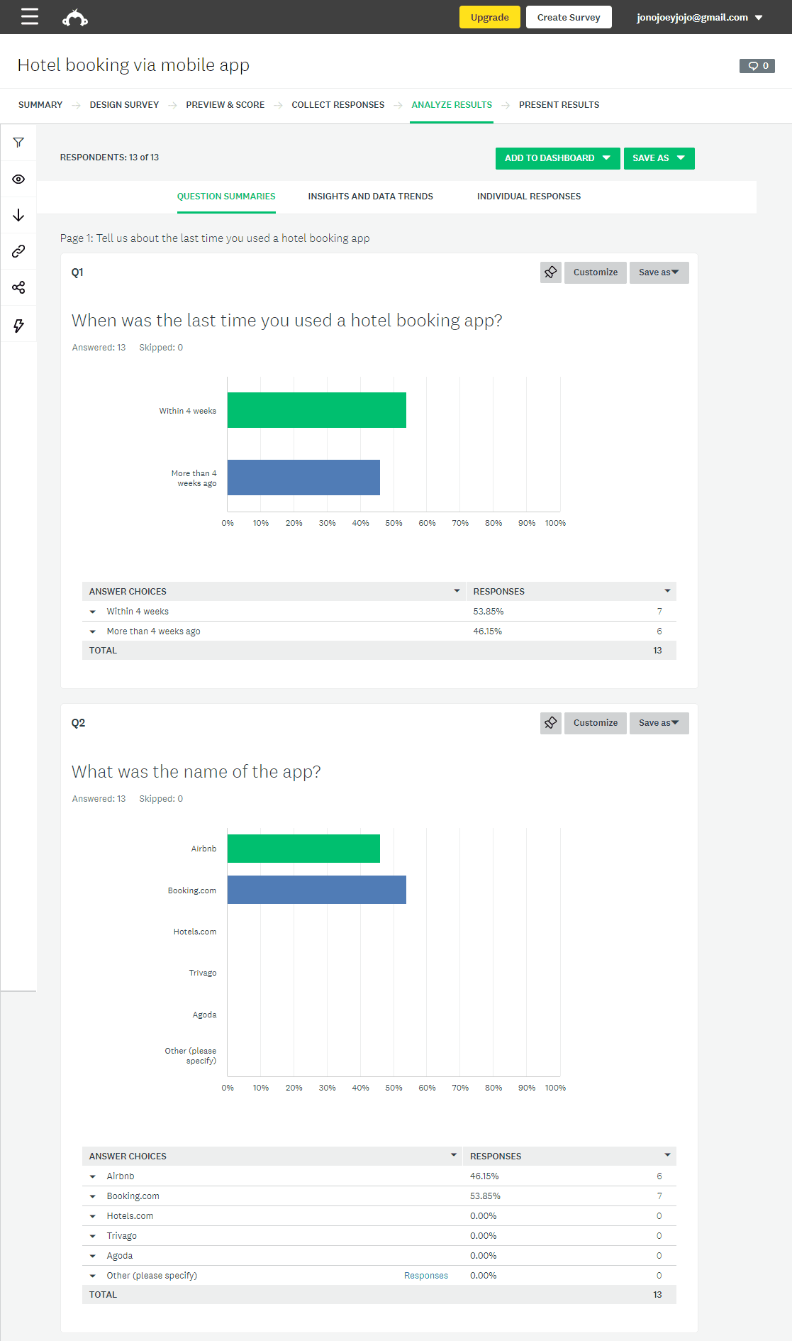
I carried out an online survey with people that fall into the hotel’s target audience to learn about their experiences booking hotels with other sites. From the results I learned that across a number of sites most people were able to make a booking easily and found the process to be intuitive. One reason for this could be that the booking process the sites followed was an accepted convention. I would next validate this in a competitive benchmark.
Through the competitive benchmark I noticed similarities in terms of user journey, navigation and features. This let me know what users expect to find in an app of this kind. The task also helped form early ideas about layout and content.
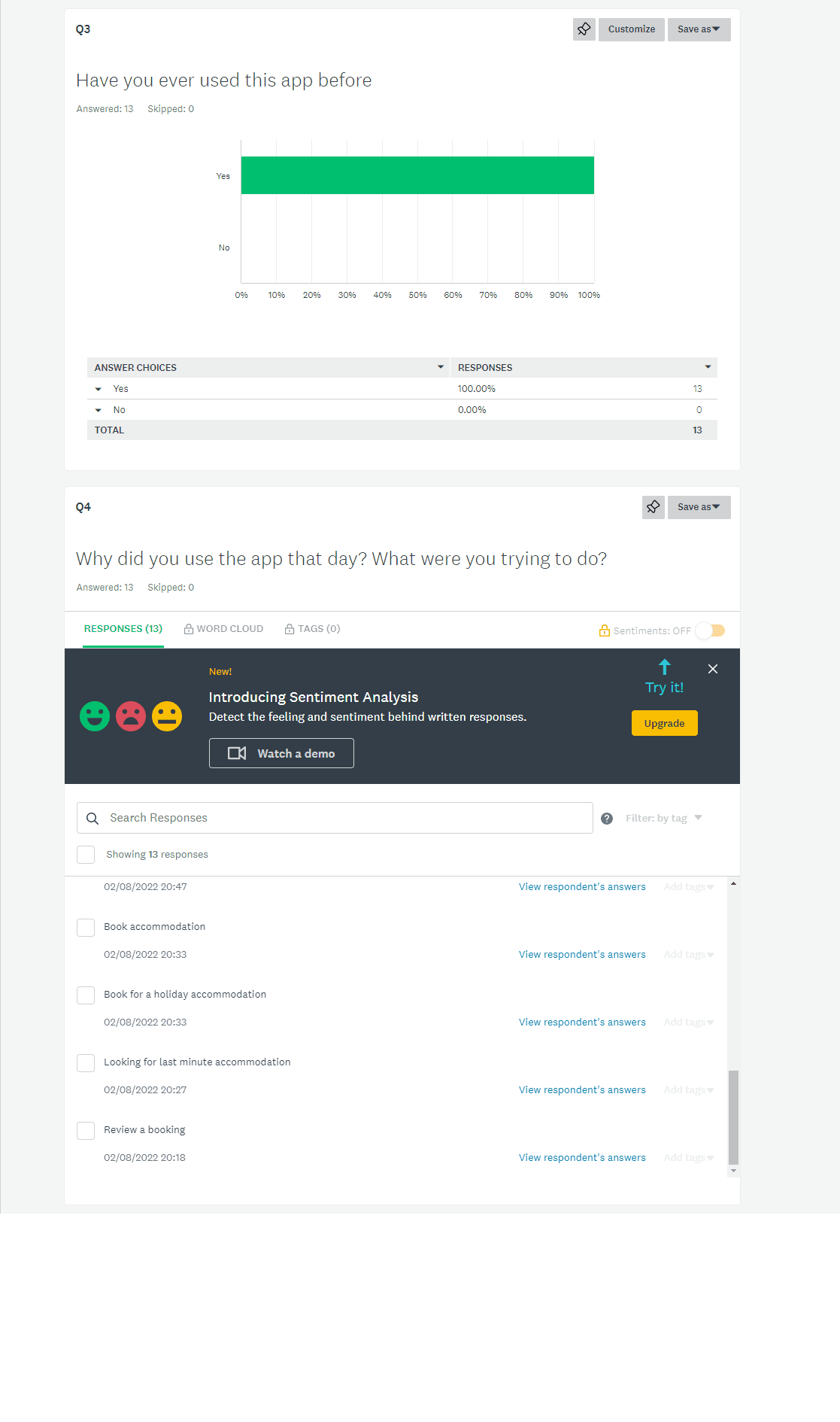
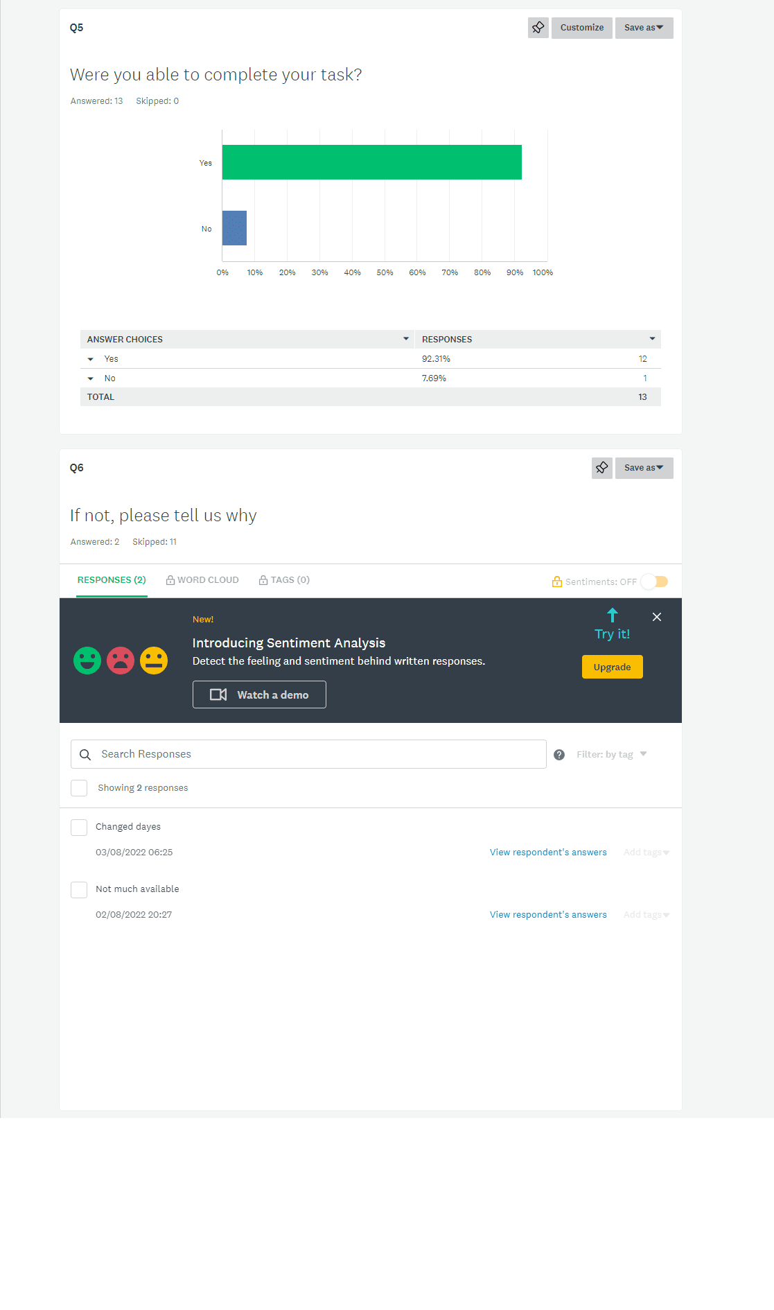
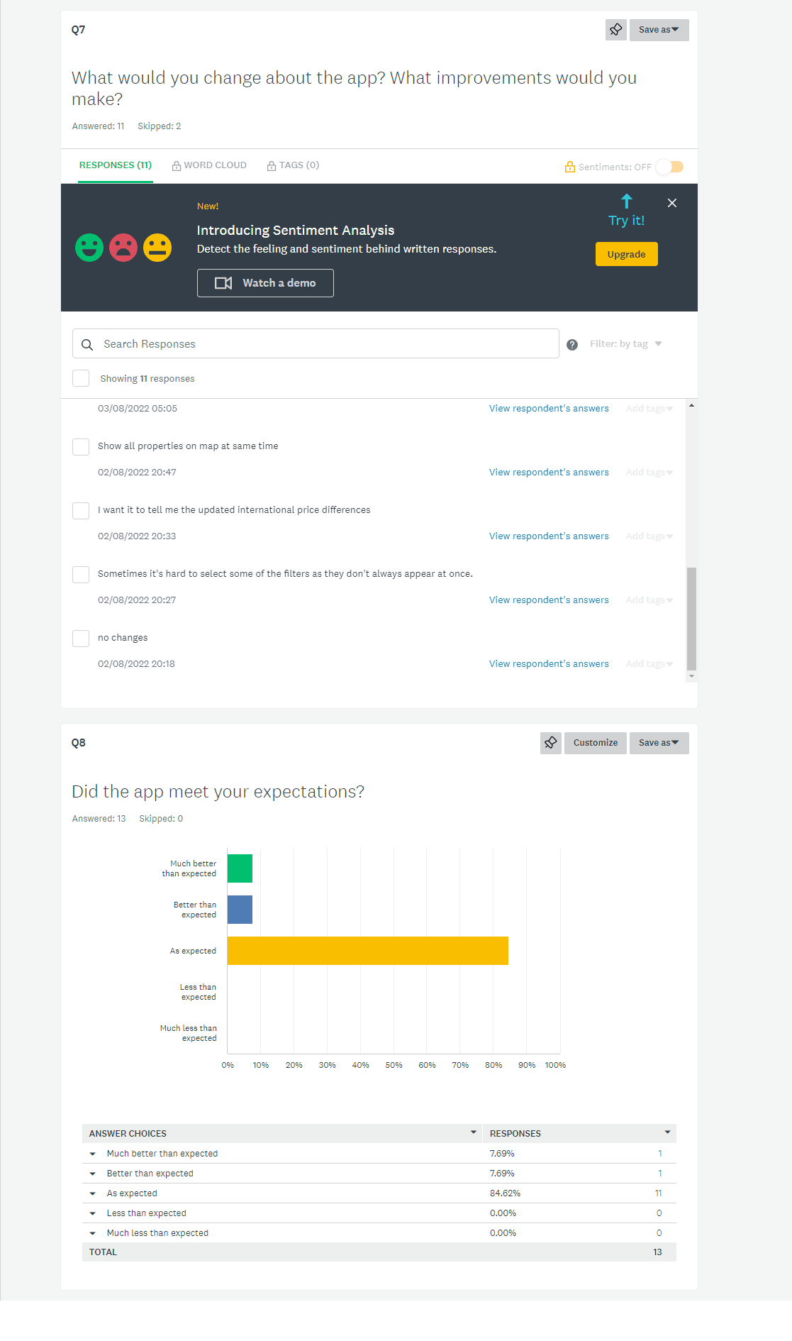
To see how people actually interacted with these products I carried out usability tests on three different competitor sites. This allowed me to follow the behaviour of users through the journey and how they interacted with it. It also highlighted pain points throughout the process which I would need to avoid in my design.
Analysis
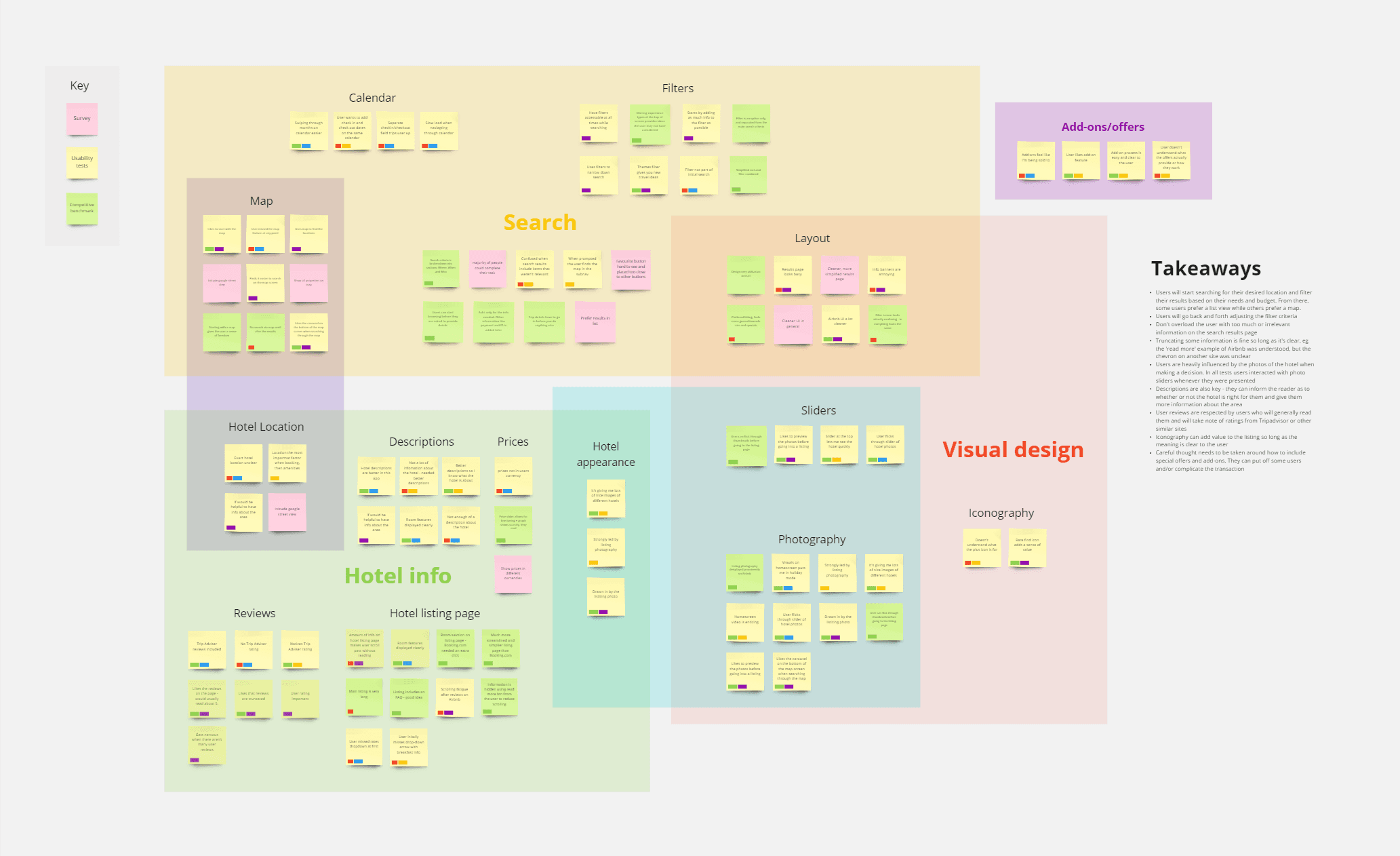
I pooled my research into an affinity diagram. This would bring out common themes which I could summarise and use to inform my own designs down the track. I was surprised by how important the listing descriptions were to many users and it was clear from the data that the search filter played a key role in the experience. Other key themes were the importance of photography and user reviews, this often created an emotional response in the user and demonstrated trust respectively. Some of the data was conflicting. The add-ons sections could be divisive and needed to be done delicately to not turn users away.
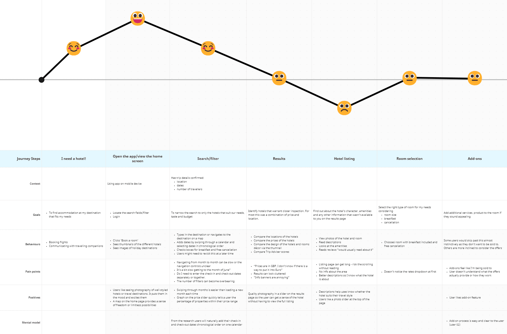
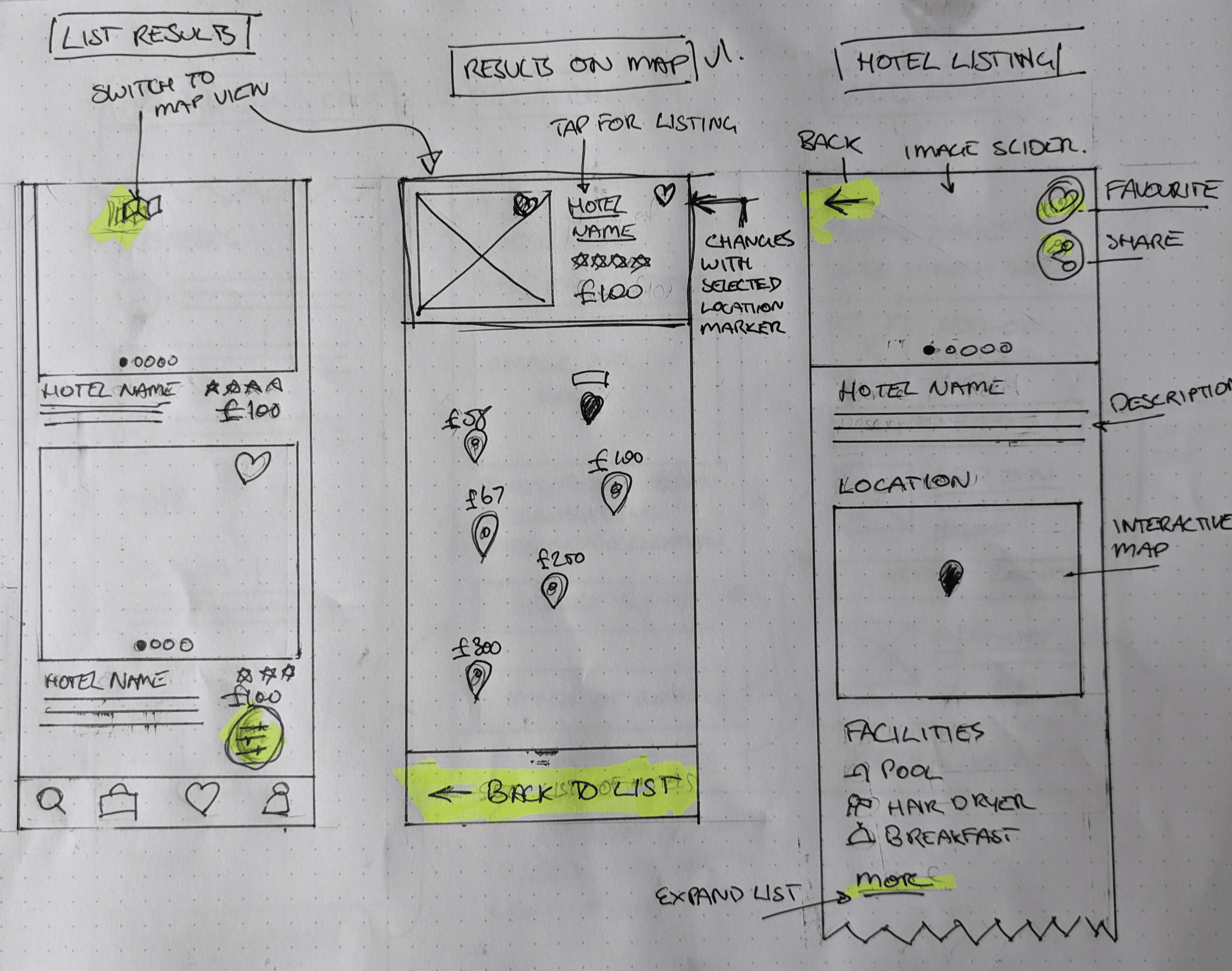
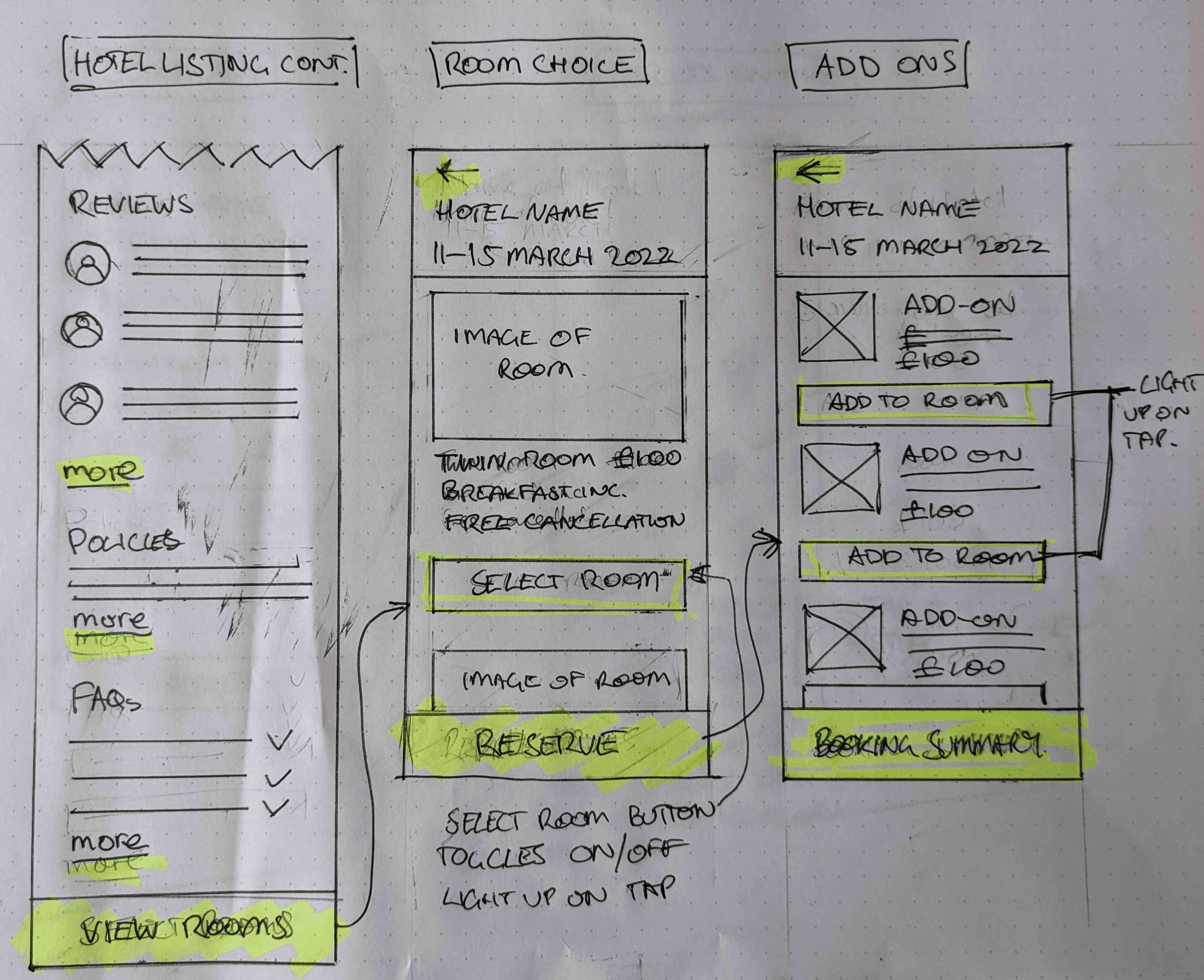
I could see from user testing that there were some steps in the process to be mindful of. To better organise this data I created a customer journey map. By breaking down the process into clear stages I could then assess how positive or negative each stage was for the user. My research showed some began to struggle on the listing page. They were often too long, making it difficult for them to find the information they were looking for, or, in some instances the information they wanted wasn’t there at all. The usability of the search results and room selection screens could also be improved. Both these pages contained interactions that users failed to grasp that could be fixed with better affordances and clearer or simpler instructions.
Design
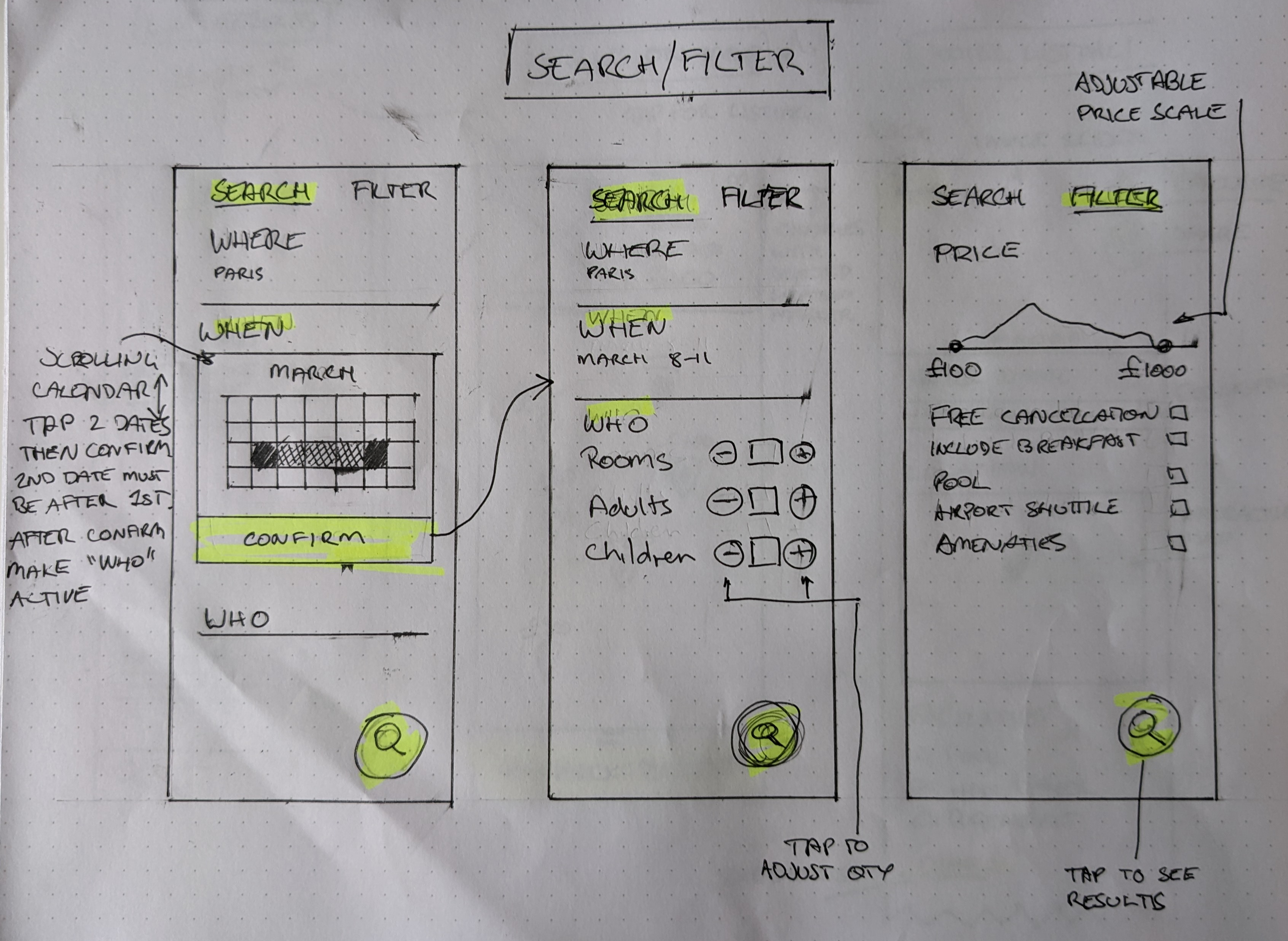
From my research I identified aspects I wanted to emulate and design solutions for some of the pain points. Beginning the journey on a screen showing featured hotels was favoured over starting with the input form (location, dates etc). I observed users go back and forth to the filter screen to make changes. This needed to be easily accessible and the amount of information had to be concise and useful to the user.
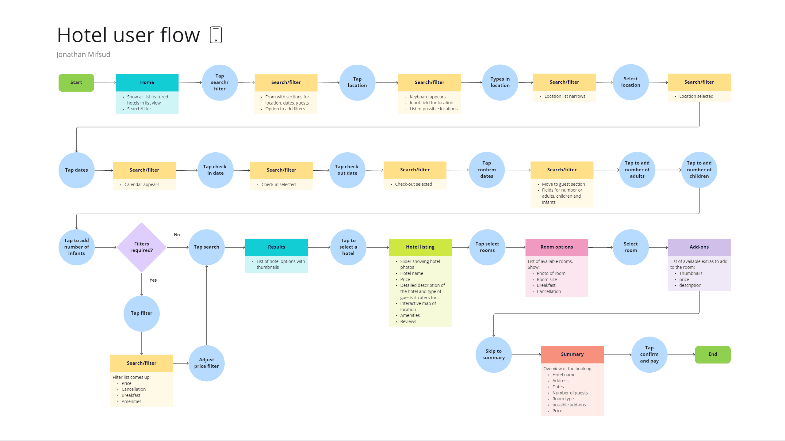
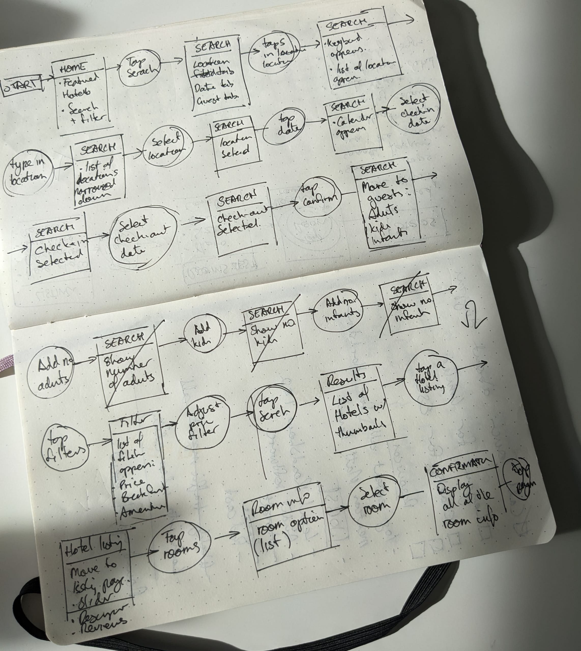
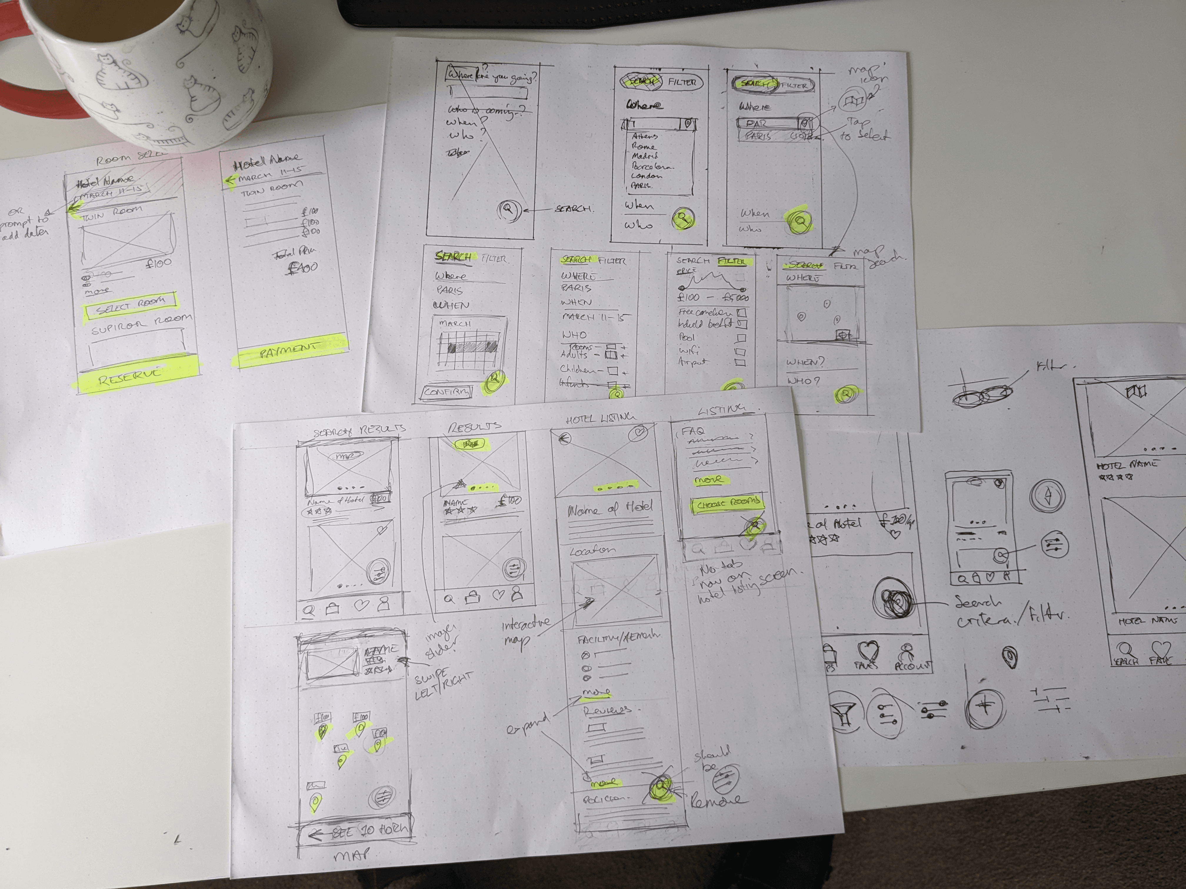
I thought about how users would flow through my app and constructed a user flow diagram based on what I considered the ideal flow. This involved inputting the trip information, adjusting a filter or two, selecting a result, then a room and finally add-ons.
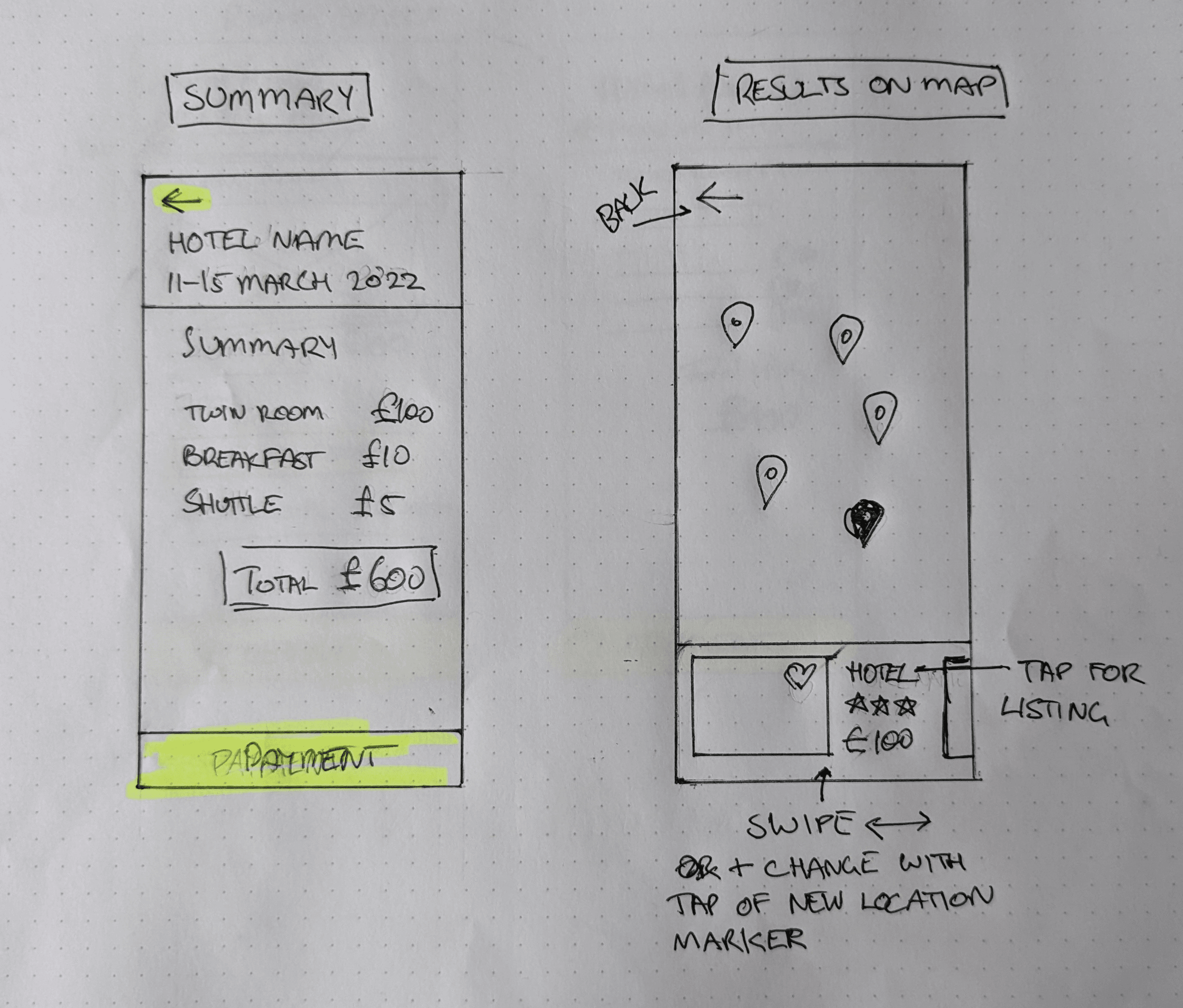
I created thumbnails of all the screens. In this process I designed solutions to a number of issues that came up in the research. The search/filter screen would be accessed by a floating button in the lower right side of the screen so it could be easily accessed. This would bring users to a screen with tabs for the trip info and filters. The app would remember what tab was active last, allowing the user to pick up where they left off. I truncated sections of long information on the listing screen to help users navigate more easily. I made sure photography was showcased by including image sliders. For those who were turned off by the add-ons screen I made it easy to skip. The Add-on themselves were uncomplicated, the price and description were clearly labelled and users could toggle them on or off to opt in or out.
Result
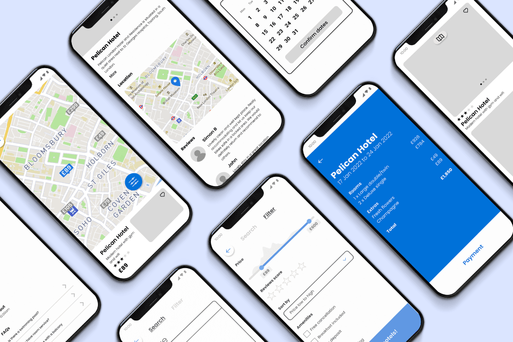
Prototype
Based on these thumbnails I created a clickable, medium-fidelity prototype. For the most accurate results please view the prototype on a desktop or via the Figma app as your browsers chrome will distort the layout. or I tried to include as much interactivity as I could by adding animations to the sliders, favourite icons and screen transitions. Finally, I created an annotated wireframe of the entire flow which could be passed on to a developer.
Reflection
I’m very pleased with the design I created but with any project there is value in looking at it again with fresh eyes. I think the search/filter button could have been refined further. Rather than making the user choose between trip info and filter on the screen, I could have built this into the button by animating it into two buttons on tap – one for trip info and one for filter. I think that this would have given the user more power and I would have loved to test these two methods with users.