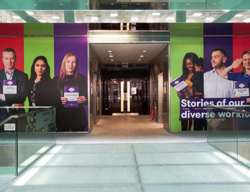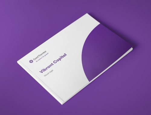
Here I explored a visual idenity for a possible campaign around Grant Thornton’s lesser known services. The idenity is based on circles derived from the mobius symbol in Grant Thornton’s logo. The circle is used to create a suite of shapes which can then be used for patterns or image masks. The is also a typographic treatment to help the campaign stand out from the firm’s usual collateral.